• Welcome to MCME!

    Minecraft Middle Earth is a Minecraft community that recreates the world described by JRR Tolkien and his writings. Everyone can participate in organized events in which we collaborate to create major landmarks, terrain, caves, castles, towns, farms and more.

    To get started, visit The New Player Guide

    Joining the server

    Joining the server can be done straight away, but you will have to pass the New Player Quiz. Use the The New Player Guide to get acquainted with our community.

    IP: build.mcmiddleearth.com

Accepted Zepubbar Artist Application

Status
Not open for further replies.
Back at it again.

Artist App Episode II: Attack of the Themed Builds
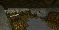
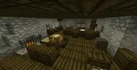
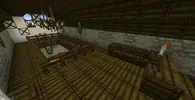
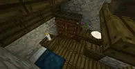
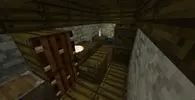
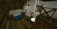
The Bridge Inn
 

Attachments

  • 2017-06-22_21.43.25.png
    2017-06-22_21.43.25.png
    1.5 MB · Views: 167
  • 2017-06-22_21.43.43.png
    2017-06-22_21.43.43.png
    1.2 MB · Views: 175
  • 2017-06-22_21.43.59.png
    2017-06-22_21.43.59.png
    462.1 KB · Views: 169
  • 2017-06-22_21.44.18.png
    2017-06-22_21.44.18.png
    455 KB · Views: 187
  • 2017-06-22_21.44.37.png
    2017-06-22_21.44.37.png
    472 KB · Views: 182
  • 2017-06-22_21.44.54.png
    2017-06-22_21.44.54.png
    626.9 KB · Views: 170
  • 2017-06-22_21.45.16.png
    2017-06-22_21.45.16.png
    368.7 KB · Views: 185
  • 2017-06-22_21.45.37.png
    2017-06-22_21.45.37.png
    301.7 KB · Views: 186
  • 2017-06-22_21.45.49.png
    2017-06-22_21.45.49.png
    476.1 KB · Views: 177
Hey Zepubbar,

I am so sorry for having you wait so long!

Here's the things I noticed:
The stone castle TB (didnt figure what TB that one was)
  • Overall it feels like it all is very small; it's an often observered phenomenon that the TB plots make build become smaller than they should be, i.e. the height of the wall is really small imo.
  • Nice choice of materials on the wall, looks very nice!
  • As was mentioned: using cobblestone as roof/upper floor is a bit cringeworthy. Best practice is to use a stony material for the bottom floor and wood for the upper floors and roof support.
  • The buildings have very few windows, makes living in those very depressing... Highly recommend adding more windows, also makes builds look more interesting; windows can very well be only 1x1 block in size.
  • It all looks very clean; some randomised dirt and cobble variants in the roads for example could make it more worn and thus more lively.
  • In the second last picture it seems like you made chairs out of the exact same material as the pillar right next to it; looks a bit odd.
  • Interesting idea to use the glass panes instead of the full blocks for the glass panes! Initially wanted to write that you should rather use the full block only, but on a second thought it looks quite good ;)
Dol Amroth
  • Again, nice choice of materials, and distinct use of them. For actual DA we now decided not to randomly mix large and small sandstone bricks and instead use the large variety of other variations that blend better, but the idea is basically the same.
  • The tudor blocks (stucco with wood beams) should not be used in randomized patterns, these beams are placed in structurally sensible places.
  • Place the entrance door on the inner side of the wall to make the wall not look so flat from outside. Place more windows for same effect.
  • Nice interior! Only input I can give there is that you can break up larger empty floor spaces with a colorful carpet.
  • There's one picture of a room that's only two blocks high. Please void such low rooms.
  • Good job on making the outside area between the houses look more interesting! But maybe you used hay bale stacks a tad too often ;)
  • The roof shapes are sometimes very complex. That's something that's rather uncommon for shingle roofs; with thatch thats rather a thing. So try to break up the houses into multiple clear wings with a straigh roof and clear corners.
Bridge:
  • What you saved in size in the castle TB you used here instead, that thing is HUGE! Okay, the width may be good like if it really shall be a bridge over which an army can walk efficiently, so okay, but the supports are really just way too massive. I mean not much more material and you've got a wall instead of a bridge. You also need to consider that this bridge is basically blocking most of the river now. A much more elegant solution would be one that does not affect the river a lot, maybe have two pillars at either shore, or else one slender one in the middle. Check out some pictures of old stone bridges, the general design is always very similar, or things like how thick and what the shape of the supports are, I guess there's a good reason for that, so it should not be very wrong to follow such an example more or less.
  • I like the work you did to detail the shapes (just except the overall shape).
  • If you make the bridge look weathere by using the mixed colors cobblestone on the supports you should also consider making the walking-part look worn out.
Glittering Caves:
  • Very interesting idea to use the prismaring there! Looks astoundingly good as usually vanilly textures do not blend at all with MCME ones. For a TB okay, but a no-go in actual builds as such blocks usually get used for something else at some point which may look a lot different than prismarine.
Bridge Inn:
  • Again, use tudor in regular patterns
  • Use logs with bark on all sides for trees, ./get logs
  • The round windows should only be used within stucco, the corners look weird else.
  • That main room is a bit big to support the ceiling solely with the walls. I'd place a few log beams within the room and maybe even some horizontally along the ceiling. Also helps to break up the room a bit and look the room more stuffed as most pubs use to be.
  • You could use a stony material for the ground floor, would fix the problem that the furniture looks exactly the same as the floor.
Okay, a applaud your effort so far and again apologise for the long response time. As you see I did find quite a few points where you'd have to chance some things until I could say the build is through and through "good". These are things I and other Designers would expect that an Artist realises these problems and fixes them resp. does not do in the first place. I want to leave it up to you now, if you think you feel read for the reasonably high expectations of the Designers I would go on and promote you to Artist. But if it turns out you're not ready yet the Designers will approach me and tell me just that upon which I will have to reconsider the promotion. I do not want to annoy people by not promoting them, I want to make sure they are not overrun by what is required of an Artist.

So, are you ready or would you like to give another TB a try?

~ Finrod
 
Thanks for the feedback and comments Finrod. To answer your question I would like to think that I'm ready for Artist. Based on your feedback it seems I have most of the general concepts down but am lacking the smaller details that set MCME builds apart from others. While I do understand this can be troublesome that I haven't perfected these yet, I would like to think that I am pretty good at adapting and learning as I work, so hopefully I can learn and fully perfect these skills as an Artist. I do also realize that I might not meet expectations as an Artist, and if I don't you have the right to revoke the rank, but hopefully that can be an incentive for me to do better work. Thanks for considering me for Artist and sorry for the endless amounts of updates :).
 
Thanks for the reply ZePubbar, and sorry for the wait time again! In that case I would already like to congratulate you to gaining the rank of Artist! I am still at work for a while, so I cannot promote you right away, you can hit up an Enforcer though and show him this post, if you want to get working in the next couple hours!
 
Status
Not open for further replies.
Top